Adaptive icons power more than two billion active devices around the globe. They arrived alongside the eighth major release of a leading mobile operating system to give every app a unified look on home screens. Icons split into two separate layers—foreground and background—so launchers can clip them into circles, squircles, teardrops or other creative shapes.
Why Android Icons Matter for UI Consistency
They keep every app looking part of the same family. As a result, users trust interfaces more when icon sizes, shapes and spacing feel consistent. On top of that, brands gain steady recognition when their logo floats over predictable backgrounds. Consistent visuals also let eyes relax, which reduces cognitive load during daily use. That's why, developers always look for how to design adaptive icons for android home screen.
Evolution Since the Eighth Release
- The ninth update added subtle tilts and parallax for a sense of depth.
- The tenth release unlocked on-touch reveal animations to delight users.
- The thirteenth launch introduced system-wide theming, which pulls colors from the wallpaper for true personalization. Throughout these changes, engagement rose as designers found fresh ways to bring icons to life.
Anatomy of Adaptive Icons
Foreground & Background Layers
Designers divide artwork into two transparent PNG or vector layers. The background layer holds a solid fill, a gradient, or even a subtle pattern. The foreground carries the main symbol along with any hard shadows or highlights. In practice, this split means launchers move the layers independently to create parallax or slide effects.
Safe Zone and Mask Constraints
Avoiding clipping issues comes down to following a simple checklist:
- Keep the main element inside a 72 × 72 dp square.
- Center artwork both vertically and horizontally.
- Leave at least 18 dp clear from each edge so text and details don’t get trimmed.
- Test under circle, squircle, teardrop and rounded-square masks before finalizing.
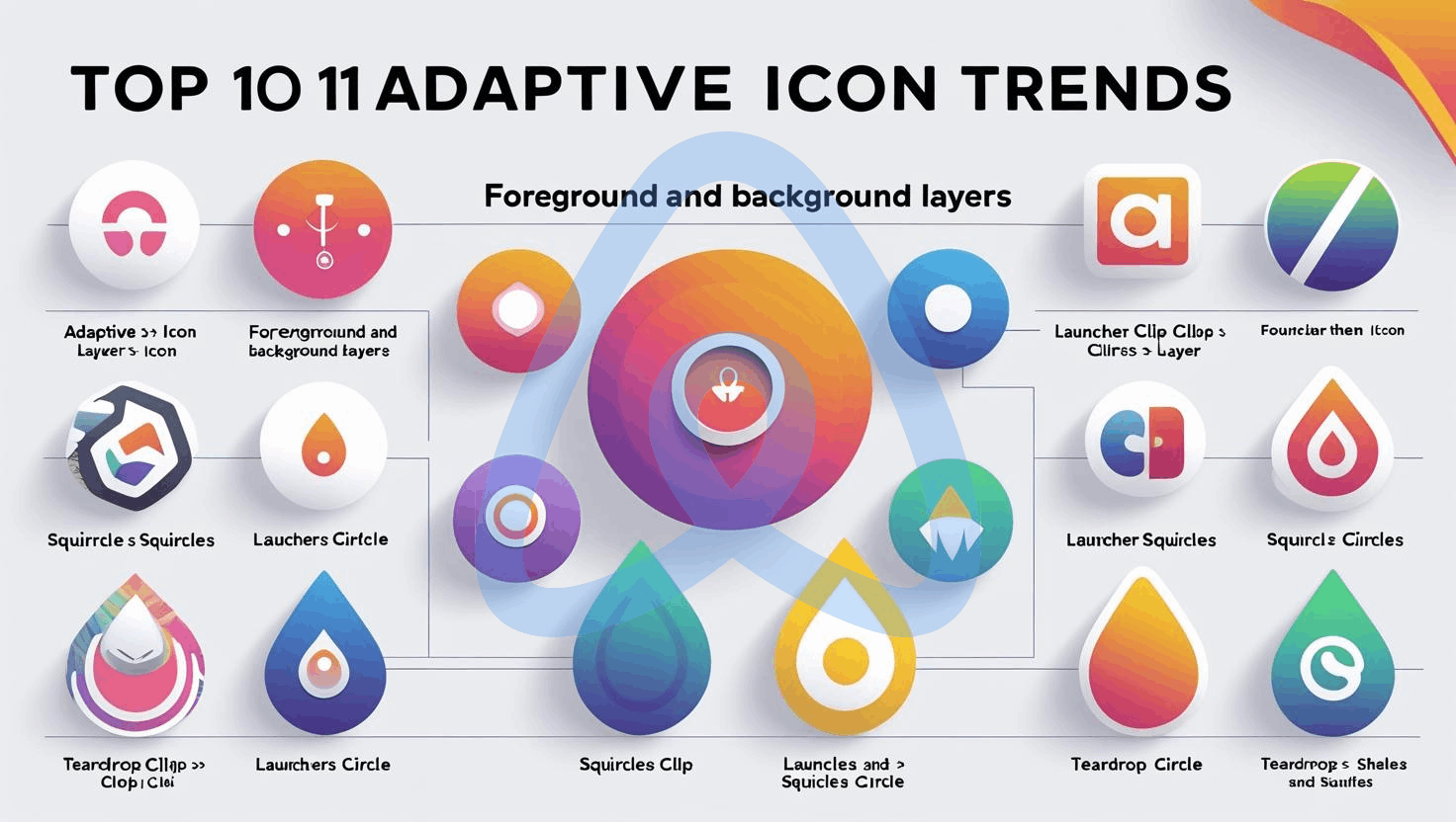
11 Top Adaptive Icon Trends
1. Material-Inspired & Dynamic Coloring
How Theming Works Now
A modern theming engine pulls a palette from each wallpaper, then applies those hues across system UI. Adaptive icons tap into that color set by tagging their monochrome layers. As a result, background tints adjust on the fly, letting icons blend into any home-screen theme.
Extracting Palette from Wallpapers
Tag the monochrome layer so launchers can swap colors without touching the main asset. Meanwhile, designers check icons in both light and dark themes to keep every detail crisp. Additionally, automated contrast checks find any hard-to-read spots before users see them.
Best Practices for Contrast & Legibility
Aim for a contrast ratio of at least 3 : 1 between foreground and background. Outlines in pure white or black keep symbols legible on shifting tints. Moreover, avoid complex patterns in the main shape. That extra step preserves clarity when icons shrink on smaller screens.
2. Dual-Tone and Gradient Effects
Trend Toward Bolder Color Transitions
Designers enjoy using two-tone overlays and smooth gradients because they add style without making things look too heavy. When you use one gradient for the background and a different one for the foreground, the icons stand out nicely on any wallpaper. In the same way, soft color changes help the eye move easily toward the symbol in the center. As a result, the whole look feels more lively and clear. In addition, this simple trick gives the design more depth and balance.
Tools & Plugins for Multi-Tone Icons
- Sketch: Gradient Transform plugin handles stops with ease
- Illustrator: Gradient Mesh tool creates organic color blends
- Figma: Color Studio plugin previews designs under popular masks
- Native IDE: Vector Asset wizard imports SVGs directly for fast iteration
3. Motion & Micro-Interaction Enhancements
Parallax and Reveal Effects
Adding movement brings static icons to life. Parallax shifts the background more slowly than the foreground for a subtle 3D effect. Meanwhile, reveal animations can fade or slide in key elements when users tap or long-press an icon.
Launcher-Driven Animations
Supported launchers accept simple XML-based animations. Designers define translation, scale or alpha changes in animated vector files. In turn, icons spring, bounce or pulse on long-press without any code in the main app.They need ways ideal for the android adaptive icons performance file size optimization.
Performance Considerations
Keep every animation under 200 ms to ensure instant feedback. Limit keyframes at three to prevent jank and reduce CPU load. On top of that, avoid overlapping motion on multiple icons at once to protect battery life.
4. Depth, Shadows & 3D Inspiration
Faux-3D Techniques with Layers
By offsetting layers and adding radial shadows, icons gain depth without real 3D assets. Designers nudge the foreground forward with a soft drop shadow baked into the background layer. That trick fools the eye into seeing a lifted shape.
Subtle Shadows vs. Heavy Embossing
Use 10% opacity shadows at 2 dp offsets for gentle depth. Avoid heavy embossing that clashes with a flat interface. Moreover, test shadows in both light and dark modes to keep contrasts balanced.
When to Use Real 3D-Modeled Assets
Targeting gamers, AR fans or immersive apps calls for GLB or USDZ icons. Otherwise, pure vectors keep file sizes low and scale sharply across screen densities.
5. Context-Aware & Responsive Icons
Location-Based Variants (e.g., Weather Apps)
Icons adapt automatically to user location. A weather app swaps sun, cloud or raindrop symbols based on local conditions. This adaptive approach boosts engagement by matching real-time facts.
Time-Sensitive States (Day/Night Modes)
Embedding dual themes into one asset lets icons switch modes at dawn and dusk. A darker background and lighter foreground pop in low light, while daytime states embrace brighter contrasting hues.
Sensor-Driven Adaptations
Reading ambient light sensors allows icons to brighten or invert colors on the fly. On top of that, geofencing can trigger festival-themed icons when users visit special events.
6. Accessibility & Inclusive Iconography
Color-Blind Friendly Palettes
Design palettes for deuteranopia or protanopia using online simulators. That extra check ensures everyone perceives key shapes and symbols equally well.
High-Contrast Modes
Offer an alternate monochrome layer with boosted white or black fills. That simple addition aligns icons with system-wide high-contrast settings.
Screen-Reader Labels
Include a clear contentDescription attribute for each icon. That practice helps assistive tools announce an app’s name and purpose.
7. Dark Mode & Themed Icon Strategies
Inverting vs. Remapping Colors
Blind inversion often produces muddy visuals. Instead, remap saturated hues to deeper tones that fit a dark mode palette. On top of that, test remapped icons under varied lighting conditions.
Designing for AMOLED Displays
Minimize bright pixels in dark mode to save battery. Large shapes with gradients from pure black to deep gray foreground make icons pop without draining power.
Testing Across Multiple Launchers
Run icons on at least five popular home-screen apps to confirm consistent masks and animations. That step ensures every user enjoys a harmonious interface.
8. AI-Driven & Generative Icon Creation
Using Generative Engines for Variations
Modern AI tools can spin dozens of icon variants in seconds. Prompt examples like “circle icon with pastel gradient and minimal logo” yield fresh concepts immediately.
Balancing Automation with Hand-Crafted Detail
After generating base designs, refine line weights, tweak anchor points and adjust shadows by hand. This workflow pairs the speed of automation with the polish only a human eye can provide.
Ethical and Trademark Considerations
Vet every AI-suggested design for accidental overlaps with existing trademarks. That safeguard avoids legal disputes and keeps icons aligned with brand guidelines.
9. Augmented Reality & Live Icons
AR-Overlayed Home-Screen Interactions
Users can scan real-world objects to trigger matching icons on their home screen. This blend of physical and digital layers offers fresh ways to explore interfaces.
Sensors Triggered Live Animations
Gyroscope data, for example, can rotate an icon when users tilt their device. That subtle motion ties digital elements to real hand movements.
Hybrid 2D-3D Icon Formats
Export both dual-layer SVGs and lightweight 3D models. Let home-screen apps pick whichever format delivers the best experience on each device.
10. Performance, File Size & Optimization
Vector vs. Bitmap Trade-Offs
Vectors keep icons crisp across densities and minimize APK bloat. Bitmaps only come into play when photographic details justify the extra size.
App Size Budgeting for Icons
Cap an entire icon set at 300 KB by stripping unused SVG nodes and simplifying path data. On top of that, compress bitmaps losslessly to preserve clarity without bloating storage.
Caching & Lazy-Loading Techniques
Load icons asynchronously on cold start so the UI stays snappy. Cache frequently used assets to further reduce memory spikes during heavy multitasking.
11. Future Outlook & Predictions
Cross-Platform Adaptive Icons (Wearable, Auto, TV)
They will spread into wearable devices, in-car displays and living-room interfaces. Each platform adds its own shape masks and motion rules.
Voice-First & Ambient Icon Interfaces
Voice assistants may trigger icon animations on smart displays. Ambient home screens could show dynamic icons that respond to background sensors.
The Next Leap in Adaptive Design
Physics-driven icons might bounce, stretch or ripple under user touch. Those playful interactions promise to delight and surprise end users every day.

Conclusion
Adaptive icons have evolved far beyond simple badges. By mastering layers, motion, theming and performance, designers can craft icons that feel alive, accessible and consistent across every device. These trends offer practical ways to delight users, boost brand recognition and push mobile interfaces toward a more dynamic future. Go for the best free online adaptive icon generator for Android to start creating your own.
FAQs
What makes an icon “adaptive”?
- Uses separate foreground and background layers
- Supports multiple mask shapes
- Allows dynamic theming and motion
How many layers does an adaptive icon have?
A full-color icon has two separate layers: one for the foreground image and one for the background image.
Which file formats work best for them?
- Vector graphics (SVG, VDG) for crisp scaling
- Transparent PNGs for layered bitmaps
- 3D assets (GLB, USDZ) for immersive cases
What size should its layers be?
Each layer should be sized at 108×108 density-independent pixels (dp). Inside that area, there’s a safe zone of 66×66 dp where your main logo or symbol must fit so it never gets clipped by the device’s shape mask.
How can designers test icon contrast effectively?
- Use automated contrast checkers
- Preview icons under light and dark themes
- Run color-blind simulators for inclusivity
What are ideal animation limits for icon motion?
- Keep animations under 200 ms
- Limit to three keyframes
- Avoid simultaneous animations on many icons